MNJ11-001
(May 2013):
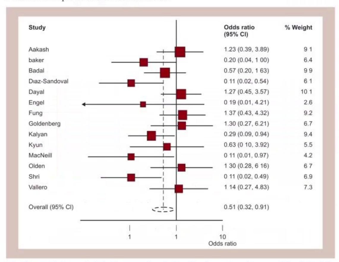
- What is the name of this plot?
- What is the arrowed figure at the bottom named as?
- In the given studies, which individual study showed the best association in view of the outcome?
- Where is this plot primarily used in medical research?
Answer
- Name: Forest plot (Blobbogram).
- Arrowed figure: Diamond (representing the pooled/summary effect estimate; the width of the diamond represents the 95% confidence interval).
- Best association: Study by Kalyan (shows greatest effect size / precision).
- Usage: Systematic reviews and Meta-analyses.
MNJ11-002
You are doing a clinical trial: "Is acupuncture better for depression than medication?". The results are shown below:
| Treatment Group | Improvement ( |
No Improvement ( |
Total ( |
|---|---|---|---|
| Acupuncture | 12 | 15 | 27 |
| Medication | 6 | 14 | 20 |
- Calculate the Odds Ratio (OR).
- What is the significance / interpretation of the calculated Odds Ratio?
Answer
-
Odds Ratio Calculation:
-
Interpretation:
The odds of clinical improvement in depression are approximatelytimes (nearly double) higher in the acupuncture group compared to the standard medication group.
MNJ11-003
In an area, the Under-5 Mortality Rate (U5MR) is
- Calculate the Child Survival Index (CSI) in that area and write down the formula.
- Write down the formulas for Incidence, Period Prevalence, and Stillbirth Rate.
- Write down the formulas for Case Fatality Rate (CFR), Attack Rate, and Secondary Attack Rate (SAR).
Answer
-
Child Survival Index (CSI):
-
Epidemiological Formulas:
- Incidence:
- Prevalence:
- Stillbirth Rate:
- Incidence:
-
Attack and Fatality Rates:
- Case Fatality Rate (CFR):
- Attack Rate:
- Secondary Attack Rate (SAR):
- Case Fatality Rate (CFR):
MNJ11-004
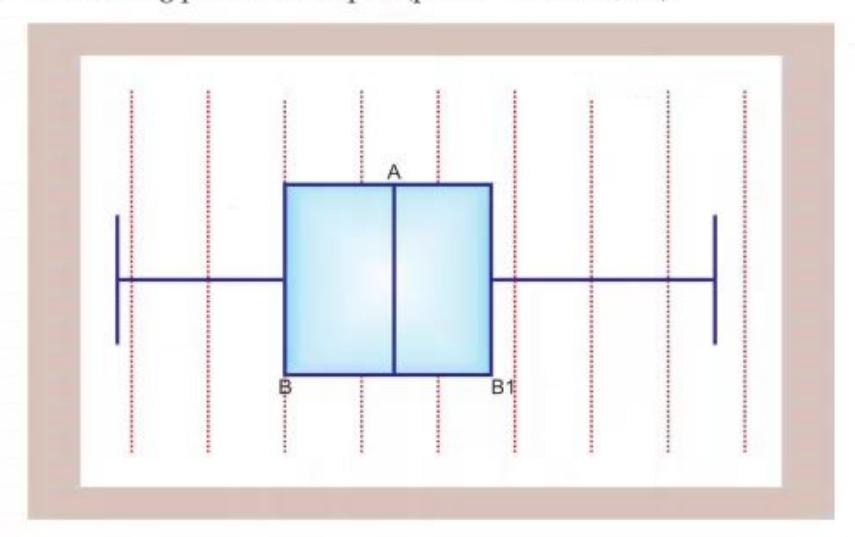
- What is the name of this plot?
- What is its use in medical research?
- Describe the following designated points in this plot:
- Point A
- Point B
- Point B1
Answer
- Name: Box-and-Whisker Plot (Box Plot).
- Use: Displays a 5-number statistical summary of a continuous numerical variable (minimum, 25th percentile, median, 75th percentile, maximum, and potential outliers/skewness).
- Components:
- Point A: Median (50th percentile / second quartile
). - Point B: Lower quartile (25th percentile / first quartile
). - Point B1: Upper quartile (75th percentile / third quartile
). - (The interquartile range
forms the central box).
- Point A: Median (50th percentile / second quartile
MNJ11-005
The following 2x2 table demonstrates the relationship between cigarette smoking and lung cancer:
| Cigarette Smoking | Developed Cancer | Did Not Develop Cancer | Total |
|---|---|---|---|
| Yes | 70 | 6930 | 7000 |
| No | 2 | 2998 | 3000 |
- Calculate the Relative Risk (RR).
- What is the clinical interpretation and value of Relative Risk in medical research?
Answer
-
Relative Risk (RR) Calculation:
(or rounded)
-
Interpretation:
Smokers have a 10 to 15 times higher risk of developing lung cancer compared to non-smokers. Relative Risk measures the strength of association between an exposure and disease in prospective cohort studies.
MNJ11-006
On auditing urine microscopy against urine culture results:
| Urine Microscopy | Pure Growth (Infection |
Multiple Growth / No Growth (Infection |
Total |
|---|---|---|---|
| 95 (A) | 15 (B) | 110 | |
| 10 (C) | 200 (D) | 210 | |
| Total | 105 | 215 | 320 |
- Calculate the Positive Predictive Value (PPV) of urine microscopy.
- Calculate the Negative Predictive Value (NPV) of urine microscopy.
- Calculate the Sensitivity and Specificity.
Answer
-
Positive Predictive Value (PPV):
-
Negative Predictive Value (NPV):
-
Sensitivity and Specificity:
- Sensitivity:
- Specificity:
- Sensitivity:
MNJ11-007

- Define Median, 1st Quartile (
), and 3rd Quartile ( ). - Define Rate and Ratio. What is the fundamental difference between them?
- What is the primary difference between a Case-Control study and a Cohort study?
- What is the difference between Incidence and Prevalence?
Answer
-
Definitions:
- Median (
): The middle value of an ordered dataset such that 50% of observations fall below and 50% above it. - 1st Quartile (
): 25th percentile (25% of observations lie below, 75% above). - 3rd Quartile (
): 75th percentile (75% of observations lie below, 25% above).
- Median (
-
Rate vs Ratio:
- Rate: Numerator is a component/part of the denominator and involves a time dimension (e.g., mortality rate).
- Ratio: Quantifies the relationship between two independent quantities; numerator is not part of the denominator (e.g., male-to-female ratio).
-
Case-Control vs Cohort:
- Case-Control Study: Retrospective; starts from outcome/disease (cases vs controls) and looks backward for antecedent exposures (yields Odds Ratio).
- Cohort Study: Usually prospective; starts from exposure status (exposed vs unexposed) and follows subjects forward to evaluate disease occurrence (yields Relative Risk and Incidence).
-
Incidence vs Prevalence:
- Incidence: Rate of occurrence of new cases in a population at risk during a specified period.
- Prevalence: Proportion of all existing cases (both old and new) in a population at a specific point in time (point prevalence) or period of time.
MNJ11-008
Calculate the Mean, Median, Mode, Mean Deviation, and Standard Deviation (SD) of the diastolic blood pressure readings given below:
Answer
- Ordered data (
):
-
Mean (
):
-
Median:
-
Mode:
-
Mean Deviation:
-
Standard Deviation (
):
MNJ11-009
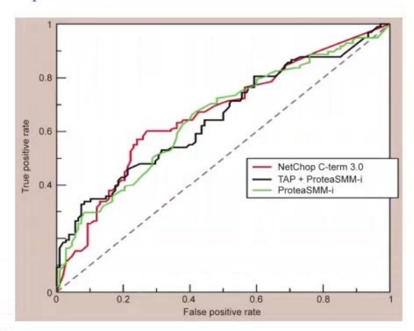
- What is the name of this curve?
- What are its uses in clinical medicine and diagnostic testing?
- What do the X-axis and Y-axis represent?
Answer
- Name: Receiver Operating Characteristic (ROC) Curve.
- Uses:
- Evaluates and compares the diagnostic accuracy of continuous diagnostic/screening tests across all possible cutoff points.
- Area Under the Curve (AUC / c-statistic) quantifies overall test discrimination power (
, ). - Identifies the optimal cutoff threshold that maximizes Sensitivity and minimizes False Positive rate (Youden index).
- Axes:
- Y-axis: Sensitivity (True Positive Rate).
- X-axis:
(False Positive Rate).
MNJ11-010
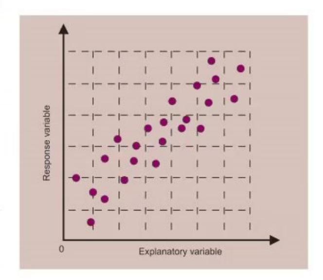
- What is the name of this chart/graph?
- What are its uses?
Answer
- Name: Scatter Plot (Scatter Diagram).
- Uses:
- Visually displays the relationship, correlation, and pattern (linear, non-linear, positive, negative, or no association) between two continuous quantitative variables.
- Evaluates data distribution and identifies outliers prior to linear regression / Pearson correlation analysis.
MNJ11-011
During a study at a hospital, the Peak Expiratory Flow Rate (PEFR) of 100 adolescent boys follows a normal distribution with a mean of
- What will be the reference range in which 95% of the boys' individual PEFR values lie in this sample?
- What will be the 95% Confidence Interval for the true mean PEFR of the population from which the sample was taken?
Answer
-
95% Sample Reference Range:
-
95% Confidence Interval for Population Mean:
MNJ11-012
A study was carried out to assess the diagnostic accuracy of an IgM ELISA test for Leptospirosis compared with blood culture (gold standard) in 100 suspect cases.
- Blood culture was positive in 40 cases.
- IgM ELISA was positive in 70 cases (of which 30 were culture positive).
- IgM ELISA was negative in 30 cases (of which 10 were culture positive).
Construct the 2x2 contingency table and calculate:
- Specificity
- Sensitivity
- Positive Predictive Value (PPV)
- Negative Predictive Value (NPV)
Answer
2x2 Contingency Table:
| Test Result | Blood Culture |
Blood Culture |
Total |
|---|---|---|---|
| IgM ELISA |
30 (TP, a) | 40 (FP, b) | 70 |
| IgM ELISA |
10 (FN, c) | 20 (TN, d) | 30 |
| Total | 40 | 60 | 100 |
-
Specificity:
-
Sensitivity:
-
Positive Predictive Value (PPV):
-
Negative Predictive Value (NPV):
MNJ11-013
A new rapid antigen test was compared with blood culture (gold standard) for diagnosing enteric fever in 500 children. Culture was positive in 400 children. Rapid test was positive in 300 children, and both culture and rapid test were positive in 260 children.
Construct the 2x2 table and calculate:
- Sensitivity
- Specificity
- Positive Predictive Value (PPV)
- Negative Predictive Value (NPV)
- Positive Likelihood Ratio (
) - Negative Likelihood Ratio (
)
Answer
2x2 Contingency Table:
| Test Result | Culture Positive (Disease |
Culture Negative (Disease |
Total |
|---|---|---|---|
| Rapid Test Positive | 260 (a) | 40 (b) | 300 |
| Rapid Test Negative | 140 (c) | 60 (d) | 200 |
| Total | 400 | 100 | 500 |
- Sensitivity:
- Specificity:
- PPV:
- NPV:
- Likelihood Ratio Positive (
):
- Likelihood Ratio Negative (
):
MNJ11-014
Write the following journal article reference in standard Vancouver style:
- Article: Hand grip strength and its relationship with birth weight in adolescent population
- Authors: Bhargava S, Sharma M and Kalra E
- Journal: Indian Pediatrics, Year 2013, Volume 78, Pages 301–305
Answer
Vancouver Reference Format:
Author Surname Initials. Title of article. Abbreviated Journal Title. Year; Volume(Issue): Pages.
Formatted Citation:
Bhargava S, Sharma M, Kalra E. Hand grip strength and its relationship with birth weight in adolescent population. Indian Pediatr. 2013; 78: 301-5.
MNJ11-015
Yearly vital statistics data (for year 2000) pertaining to deliveries and outcome in a community is as follows:
- Total births:
- Stillbirths:
- Preterm deliveries:
- Early neonatal deaths (first week of life,
): - Late neonatal deaths (
): - Infant deaths (during first year of life):

Calculate demonstrating all formula steps:
- Perinatal Mortality Rate (PMR)
- Neonatal Mortality Rate (NMR)
Answer
-
Perinatal Mortality Rate (PMR):
-
Neonatal Mortality Rate (NMR):
MNJ11-016
Match the Oxford Centre for Evidence-Based Medicine (CEBM) Levels of Evidence with their study designs:
| Level of Evidence | Characteristics |
|---|---|
| Level I | Case series |
| Level II | Lesser quality RCT (e.g., |
| Level III | Expert opinion without explicit critical appraisal |
| Level IV | High-quality RCT with statistically significant difference or narrow confidence interval / Systematic review of Level I RCTs |
| Level V | Case-control study, retrospective comparative cohort study / Systematic review of Level III studies |
Answer
Correct Match:
- Level I: High-quality Randomized Controlled Trial (RCT) with narrow confidence intervals / Systematic review with meta-analysis of Level I RCTs.
- Level II: Lesser-quality RCT (
follow-up, lack of blinding) or Prospective cohort study. - Level III: Case-control study or Retrospective comparative study.
- Level IV: Case series / Poor-quality cohort and case-control studies.
- Level V: Expert opinion without explicit critical appraisal, bench research, or consensus statements.
MNJ11-017
Determine the sample size (
Answer
Sample Size Formula for Quantitative / Continuous Data (Mean):
(Where
Required Sample Size:
MNJ11-018
The Peak Expiratory Flow Rates (PEFR in L/min) of 10 children of the same age and height are as follows:
- What is the Range?
- What is the Mean and Mean Deviation?
- What is the Standard Deviation (SD)?
Answer
-
Range:
-
Mean (
) and Mean Deviation (MD): - Mean:
- Mean Deviation:
- Mean:
-
Standard Deviation (
):
MNJ11-019
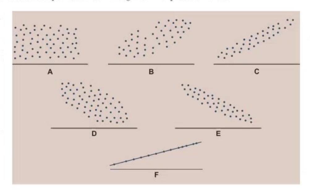
- Identify the diagram type.
- What is its clinical/statistical use?
- Name and interpret each correlation pattern from A to F shown in the figure.
Answer
- Diagram: Scatter plots demonstrating different patterns of Correlation.
- Use: Visual analysis of the direction, form, and strength of the relationship between two quantitative variables.
- Patterns:
- A: No correlation (
). - B: Weak / Moderate positive correlation.
- C: Strong positive correlation (
). - D: Weak / Moderate negative correlation.
- E: Strong negative correlation (
). - F: Perfect positive correlation (
) or curvilinear/nonlinear relation.
- A: No correlation (